
Background
Before we begin, I have released my confidential information under the Non-Disclosure Agreement (NDA). All information here is my personal opinion and may not reflect the views of Joblogic.
Joblogic is a UK-based Field Service Management (FSM) company that was founded in 1998 and has developed an effective service management system. The Joblogic ecosystem includes Joblogic web landing page, Joblogic web app for back office, Mobile app for Engineers and Customer portal for customers.
Joblogic web app for back office has undergone updates, improvements and added features to meet the increased demand and growth of the company. Otherwise, the mobile app (except for the Visit part) hasn't been updated in the past few years. Therefore, we were tasked with redesigning the Joblogic mobile app.
So why did we do this?
There are many reasons driving this project:
1. Business:
We want to improve user experience and meet the growing needs of customers to be able to compete with products available on the market.
2. Technology:
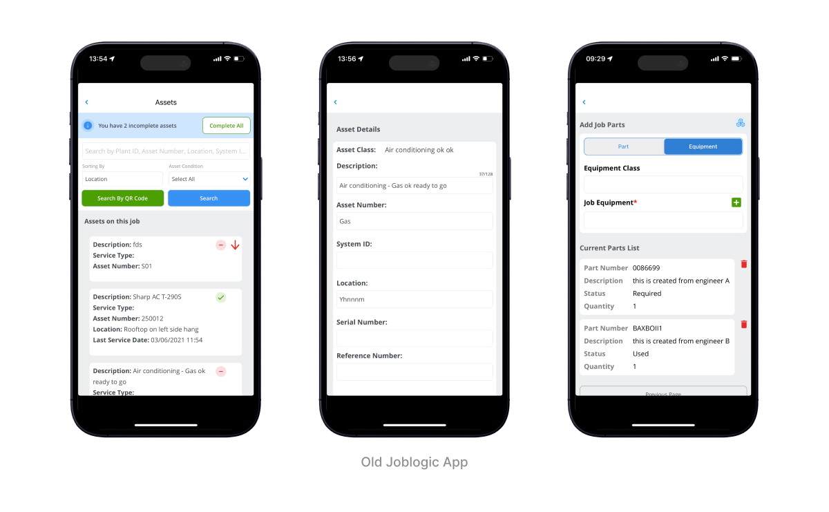
Outdated technology affects application stability, security and maintainability. The previous application design and architecture were difficult to scale due to the use of outdated technology (Mobile Web using Cordova).
3. User Interface:
Interface is inconsistent, outdated design, lacks modern design principles, lacks aesthetics and is not optimized for different mobile devices.
4. User’s pain points:
Complicated UX flow makes it difficult for users to navigate and access desired features. Our ability to expand our features is limited.

Objectives
Joblogic mobile app redesign
Create a user-friendly design that aligns with Joblogic's design system and delivers an engaging and productive experience for engineers.


Role
Lead UX UI Designer
Team
5 designers
1 product owner
2 business analytics
5 developers
2 QCs
Timeline
2022 - 2023
Responsibilities
- Planning and scope definition
- User Research, deconstruction the current design, sitemap, competitor
- UX & UI Design
- Create and iterate on a prototype draft to gather user feedback
- Check the implementation progress of the design team
- Support dev team & QC during code and release phase
Design Process

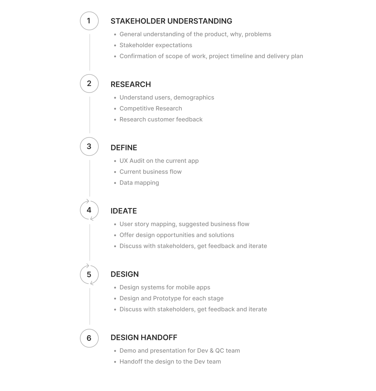
Stakeholder Understanding
Starting this project, we had a kick-off session with stakeholders based on the Q&A List we sent them previously, to cover the following key points:
- General understanding of the product
- Stakeholder expectations
- UX & UI Design
- Redesign purposes: Why redesign? Who are the target users? What to redesign?
- Product business visions
- Confirmation of scope of work, project timeline and delivery plan.
Key findings
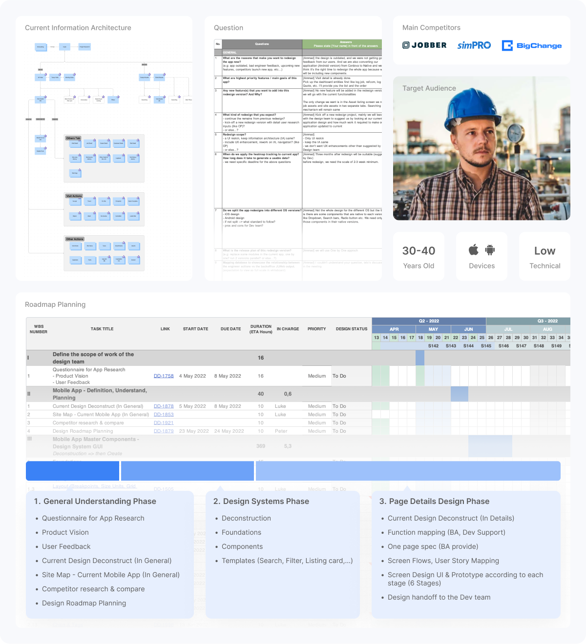
- Target Audience: Engineer user group, Mainly Male in 30s to 50s, Android and IOS devices, Low technical
- Main Competitors: Jobber, Simpro & BigChange
- Main Challenge: Redesign UI/UX and make it more user-friendly and improve UX
- Design scope: New UI, improve UX a little bit, restructure IA, create Component library & Design Systems
- Delivery planning: Will be implemented in 6 stages

Understanding the users
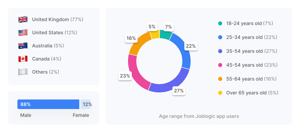
Based on information obtained from the customer service team and Google Analytics, we determine who our users are? age? geography?
Key findings
- Most app users are male (88%)
- Most of them are aged 35-54 (50%)
- The majority of app users are from the UK (77%)

Competitive Research
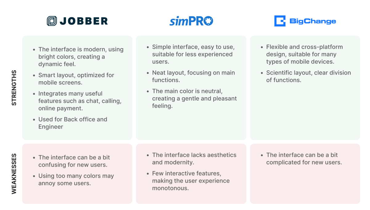
Understanding the strengths and weaknesses of leading competitors in design and technology helps us identify current problems that our products can solve. It helps predict threats, address challenges and make strategic choices for success
Key findings
- Jobber has a modern interface and smart layout, optimized for mobile screens.
- BigChange has a flexible design and is compatible with many different screen sizes.

Research customer feedback
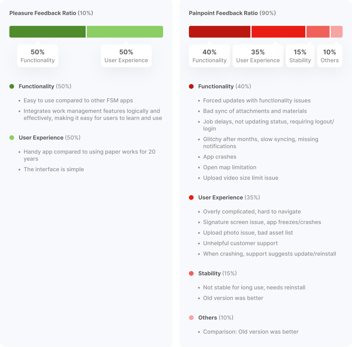
Customer feedback and reviews on TrackerGo, Appstore, Playstore are also very important information for us to better understand user needs to improve and retain current users.
Key findings
- The good point is that it is easy to use compared to other FSM apps and more convenient than using paper works.
- However, there are still many issues with updates, instability for long-term use, difficulty navigating and the flow is too complicated.
- Most reviews (75%) highlight negative aspects, mainly concerning functionality (40%) and user experience (35%).
- Functionality issues include forced updates with bugs, data syncing problems, app crashes and limited features.
- User experience suffers from complexity, glitches and unhelpful support.
- Stability concerns include short-term functionality and preference for older versions.
- Only 10% of reviews mention positive aspects, highlighting ease of use compared to alternatives.

UX Audit on the current app
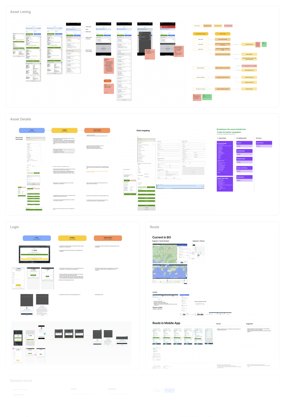
We reassess existing user interface issues for each feature or module using Heuristic Evaluation. At the same time, re-evaluate the product structure.
Key findings
- Discovered many problems and they were repeated everywhere
- Inconsistency in design elements: Inconsistencies in buttons, dropdowns, font sizes, icons and colors can cause confusion and frustration for users
- Some component states are quite confusing. Eg. Active/InActive button status
- Writing inconsistent, confusing UX causes user misunderstandings and difficulties when interacting with the product. Eg. the title tab of the page is sometimes available and sometimes not
- It takes quite a few steps to complete a task
- Missing empty state
Opportunity for improvement
Based on the findings, we make suggestions to improve them.

Design System for mobile app
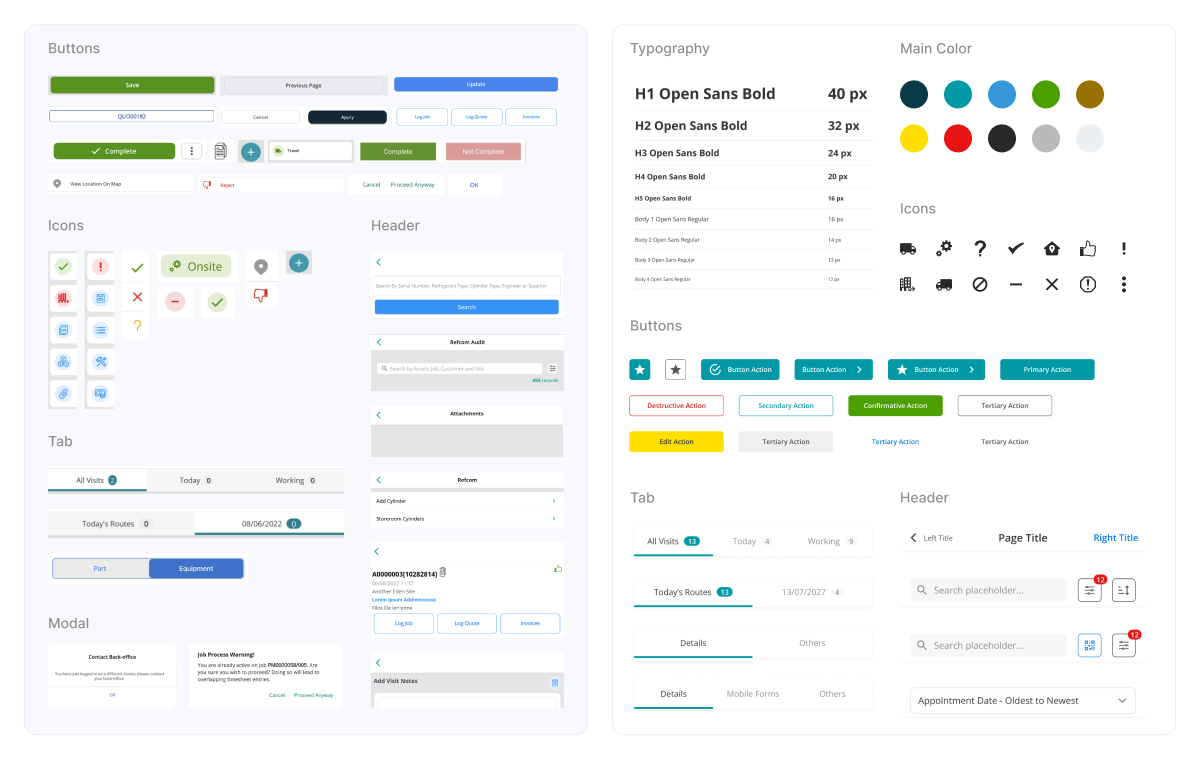
A design system will ensure design consistency and scalability across the entire product. It will be a common standard for everyone to flow up including colors, typography, iconography and creating important elements like buttons with their respective variations.
We decode the current application and then create the design system for the mobile app.

Redesign
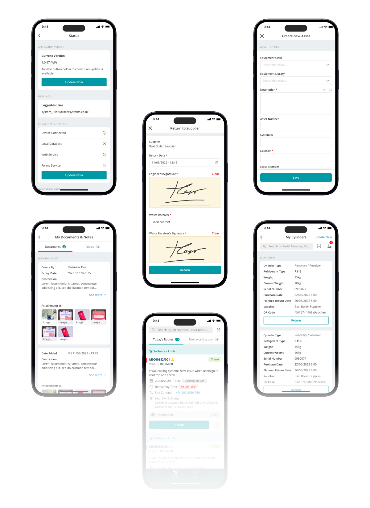
Asset Listing
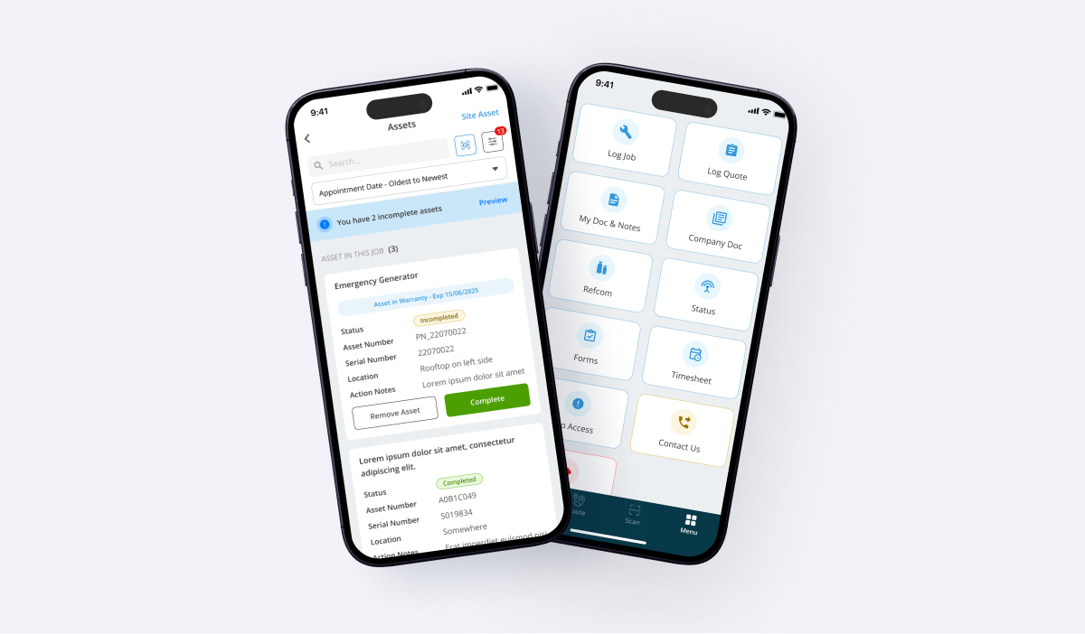
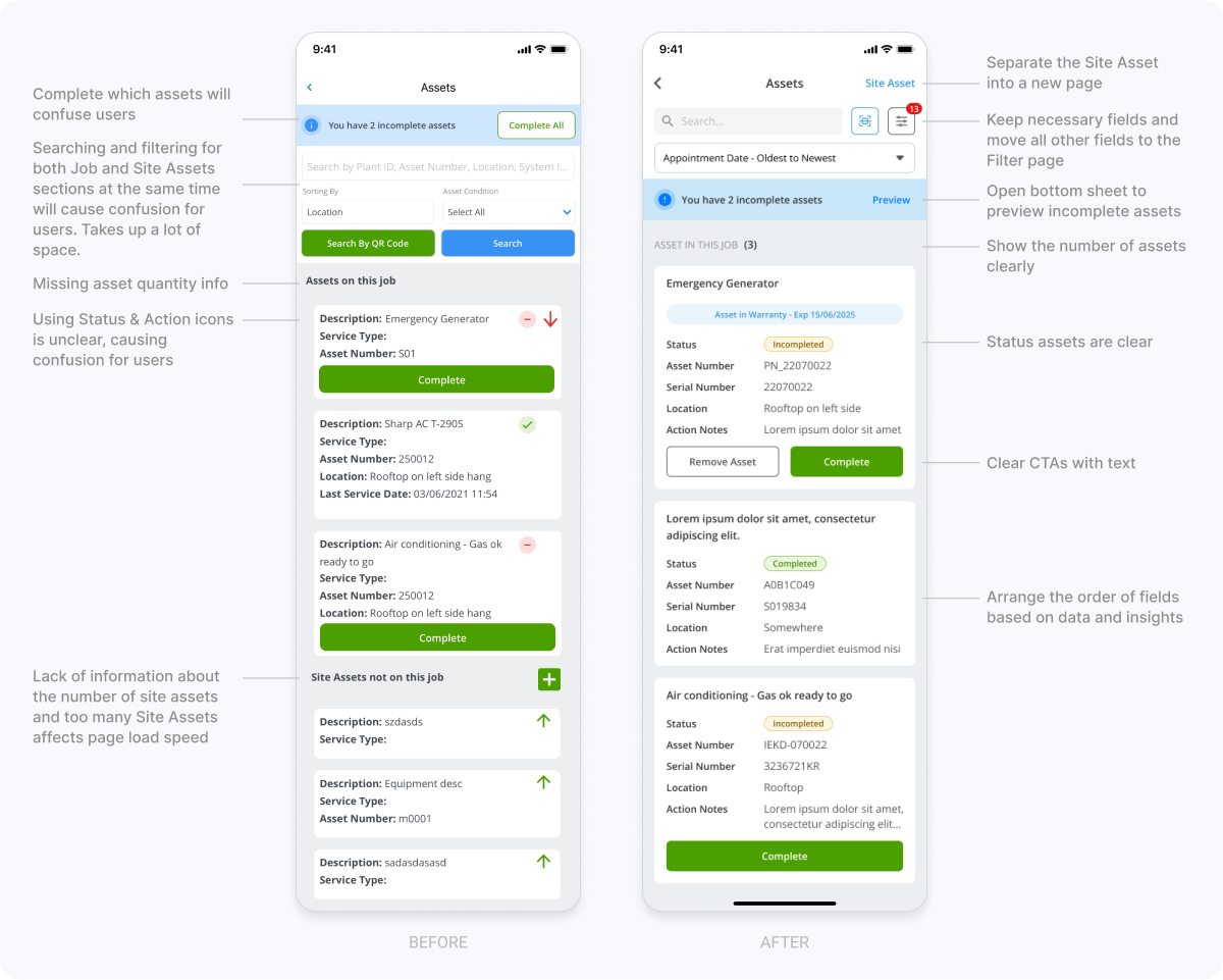
The page displays all the assets in a job that the engineer is working on. And that engineer can add or remove assets to the job being done on that site.
On this page, we optimized the Search and Filter, Asset Card sections and divided them into 2 pages for assets in this job and Site assets.

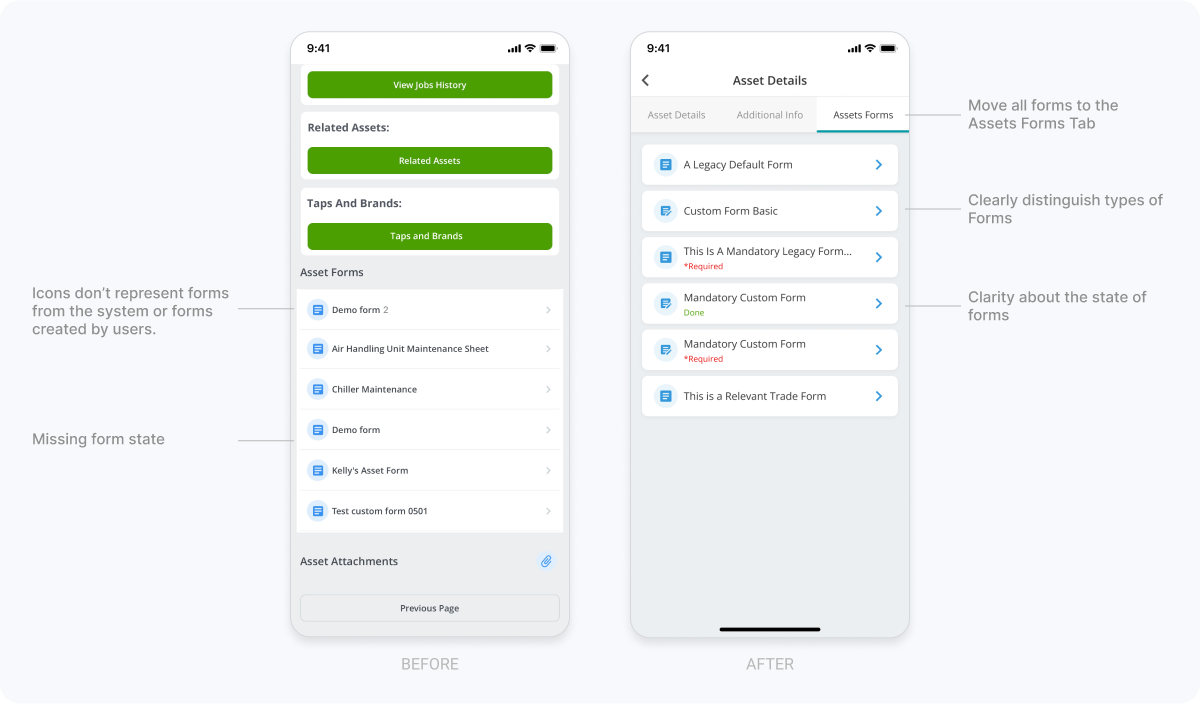
Asset Details
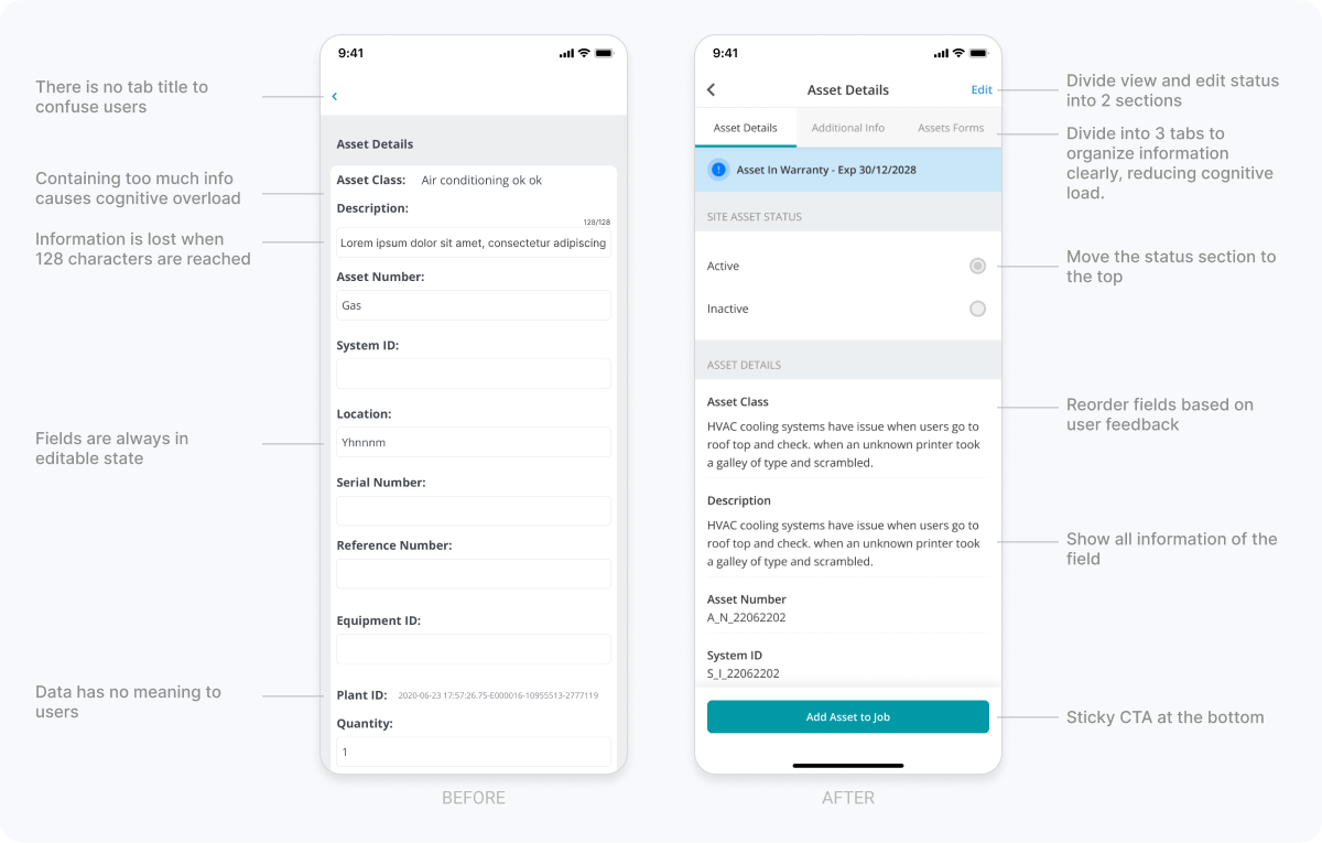
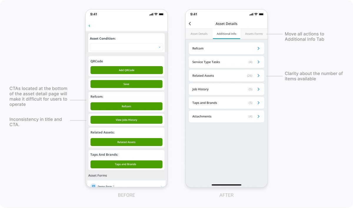
The page displays all Asset information. The problem is that too much information placed on one page causes cognitive overload for the user. Therefore, we group related information together by dividing it into 3 tabs (Details, Additional Info and Assets Forms).



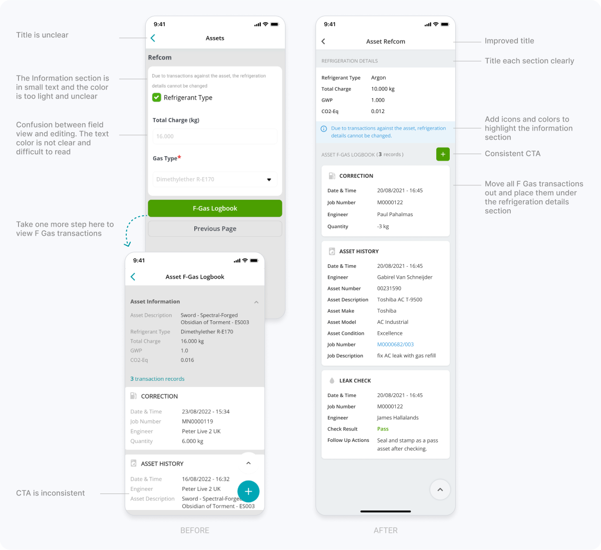
Asset Refcom
To comply with F Gas regulations, engineers need to record every F Gas transaction, every use of F Gas and all leak tests they carry out.
Based on previous research, we decided to combine the Refcom information page and the F-Gas logbook into one. This minimizes the user's actions. Improve user experience.

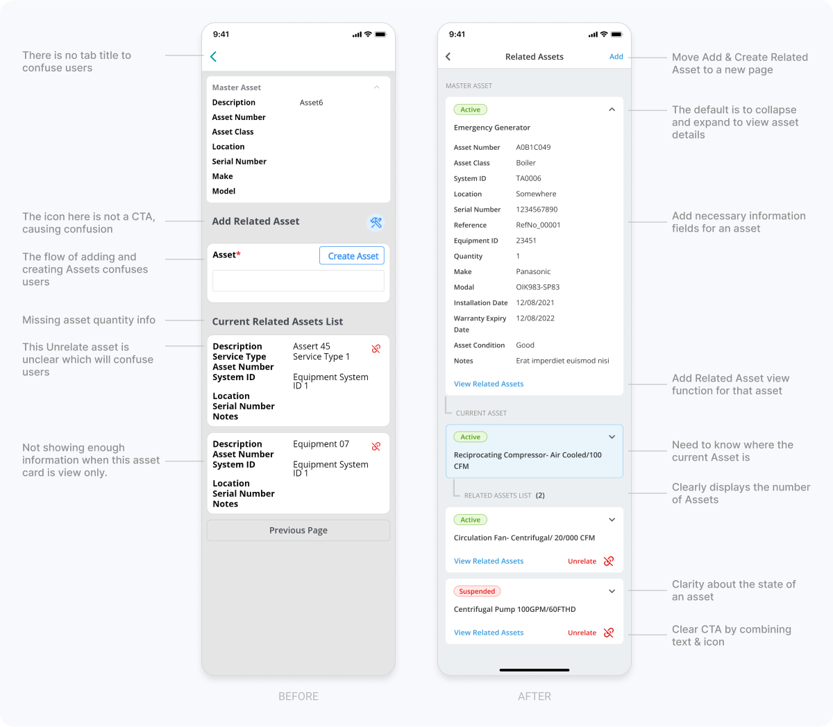
Related Assets
All related Assets are managed here. It's like a sitemap, you need to represent them like that.

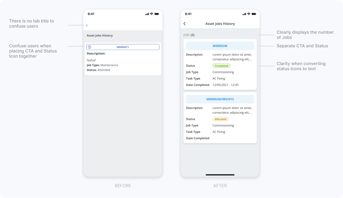
Asset Jobs History Listing
This is the page that lists all Jobs related to the asset that the engineer is working on.

Other screens
In addition, we also create many feature pages based on the current app that we have. Eg. Notes, Attachments, Status & Settings, Documents, Tasks, Expenses, Parts, Equipments, Invoices, Quotes, ...

Result
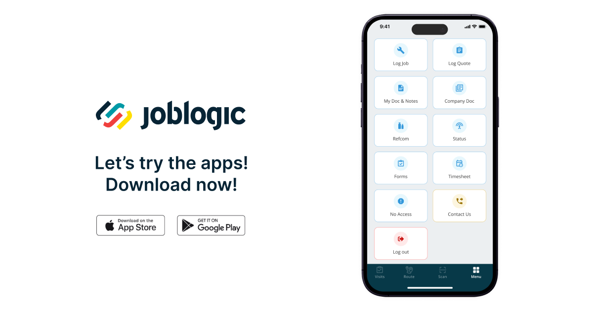
Mobile app versions are released on Google Play and App Store in stages
We have successfully launched Mobile App versions on schedule according to each phase that we had previously planned and received positive feedback from customers.

What I learned
1. Consistency and scalability are important
Developing a comprehensive design system and style guide is proven to be an effective way to ensure consistency across multiple screens and interactions.
2. Collaboration is key
Effective collaboration between designers, developers and stakeholders is essential to ensure that everyone involved in the project is on the same page and that the project runs smoothly.
3. Take it step by step
We learned how to break down complex designs into small, manageable pieces. This makes it easier to develop and handle bugs as we go.
Next steps
This project is still continuing with:
- Continuous development of new features based on planning and customer requirements.
- Get customer feedback, constantly improve the product experience.
Thanks
Below are some of my amazing contributions at Joblogic, but it wouldn't be possible without the support from our excellent team!
A big thank you to the heroes in the development team, quality control team and design team.